Internal Platform Design System (NDA)

Designing a scalable, shared system to ensure consistency across a multi-product platform

ROLE
UX Designer
TIMELINE
Multi-phase initiative (2022)
TOOLS
Figma, component libraries, documentaion programs
hero mockup

Overview

I collaborated with the UX Lead to design and evolve an internal design system intended to serve as a single source of truth for multiple product teams working across a complex platform.

Because design work was distributed across different teams and products, the design system needed to support consistency without rigidity—providing shared foundations while accommodating varied use cases, workflows, and feature requirements.

The Problem

Design efforts across the platform were highly segmented, with different teams working on different products and features. Without a unified system, this led to:

  • Inconsistent UI patterns and interaction behaviors
  • Duplicated design effort across teams
  • Difficulty maintaining accessibility and usability standards
  • Increased cognitive load for users moving between products

As the platform grew, these inconsistencies became more difficult to manage and scale.
The Solution

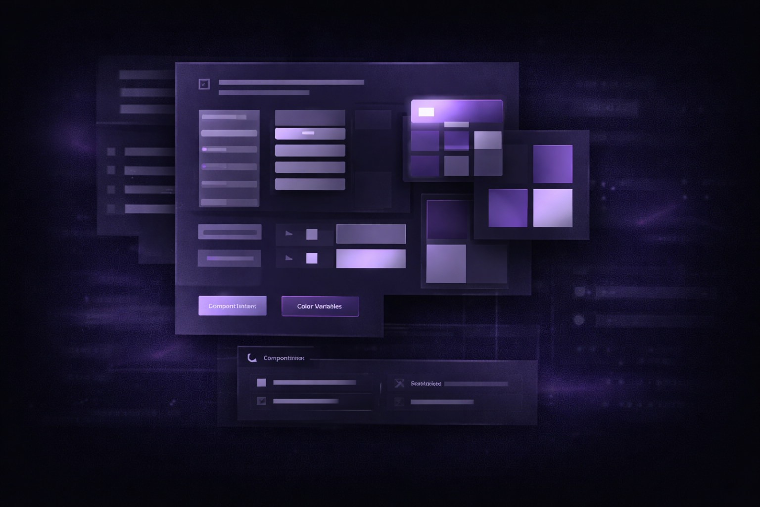
We created a comprehensive internal design system that centralized UI components, interaction patterns, and usage guidance. The system was designed to:

  • Act as a shared foundation across all products
  • Support a wide range of use cases through flexible component variants
  • Enable designers to move faster without sacrificing consistency
  • Improve cross-product usability and cohesion for end users

Results & Impact

Improved consistency across products within the platform

Enabled faster onboarding for designers joining new projects

Established a single source of truth for UI and interaction patterns

Made accessibility considerations easier to apply consistently

Contraints & Consideration

  • Multiple products with distinct requirements and edge cases
  • Designers working independently across teams and timelines
  • Need to balance flexibility with standardization
  • Components had to scale for future features, not just current needs
  • System needed to evolve without breaking existing designs

These constraints required careful consideration of component structure and variant strategy.

Research & Discovery

Discovery focused on understanding existing design patterns and gaps across the platform:

  • Audit of existing product UIs to identify inconsistencies
  • Review of commonly reused components and custom solutions
  • Alignment with accessibility standards and UX best practices
  • Collaboration with designers to understand real-world use cases

This research informed which components needed to be standardized and where flexibility was essential.

Key Insights

  • Overly rigid systems slow teams down; flexibility is critical
  • Clear documentation is as important as the components themselves
  • Component variants reduce the need for one-off design solutions
  • Shared interaction patterns improve user confidence across products
  • Design systems must evolve alongside the product, not remain static

Design & Exploration

Design work focused on building a modular, scalable component library, including:

  • Core components (buttons, inputs, typography, layout)
  • Complex components (forms, dialogs, tables, navigation)
  • Multiple variants per component to cover diverse use cases
  • Defined interaction states (hover, focus, error, disabled)
  • Clear spacing and layout rules to ensure visual consistency

Components were iterated collaboratively and refined based on real usage across products.

Development Collaboration

While primarily design-focused, the system was created with implementation in mind:

  • Components were structured to be developer-friendly
  • Design decisions considered feasibility and reuse
  • Ongoing collaboration ensured alignment between design intent and technical constraints

This helped reduce friction during handoff and implementation.

Validation & Exploration

Validation occurred through:

  • Ongoing feedback from designers using the system
  • Identifying gaps as new product needs emerged
  • Iterative refinement of components and variants

The system evolved through real-world usage rather than being treated as a one-time deliverable.

Reflection

This project reinforced the importance of systems thinking in UX design. Building a design system is less about creating perfect components and more about enabling teams to work efficiently while maintaining a cohesive user experience.

If given more time, I would further expand documentation, explore automated accessibility checks, and deepen alignment with development frameworks to strengthen long-term scalability.

Thanks for reading!

View more projects