Brunner Website Redesign

Redesigning the Brunner Works website after branding updates

ROLE
UX Designer
TIMELINE
2 months (2023)
TOOLS
Figma, Figjam, Miro
Brunner website hero mockup

Overview

Brunner is a full-service integrated marketing agency known for blending creative excellence with data-driven strategy to solve complex brand challenges and grow business performance.

Following a brand refresh and updated creative direction, the website redesign aimed to align the digital experience with the new brand personality — elevating clarity, expressiveness, and accessibility while supporting business objectives and lead generation.

The Problem

The existing website did not fully reflect Brunner’s evolved brand values and visual identity. Navigation and content hierarchy felt inconsistent with the refreshed voice and positioning, potentially hindering audience perception and engagement.

The Solution

We redesigned the entire web experience to:

  • Reflect updated brand personality and tone
  • Improve clarity and information architecture
  • Strengthen access to work examples and services
  • Elevate visual storytelling through updated imagery and layout
  • Enhance accessibility and usability across devices

The redesign balanced strategic positioning with practical UX improvements, ensuring both brand expression and usability were elevated.

Results & Impact

Higher engagement on key pages and lower bounce rates

Improved clarity, content hierarchy, and discoverability

Alignment with refreshed brand positioning across site

Enhanced user confidence in agency capabilities

Contraints & Consideration

  • Tight alignment needed across design, content, and technical implementation teams
  • Multiple stakeholders with strong opinions on brand expression and business goals
  • Need to maintain SEO performance and traffic continuity during redesign and relaunch
  • Ensuring accessibility standards were upheld without compromising creative brand expression

Research & Discovery

Research phase included:

  • Stakeholder workshops to clarify business goals and brand priorities
  • Competitive benchmarking of agency websites within the marketing sector
  • Content inventory and mapping to understand gaps and opportunities
  • User journey assessments to clarify how visitors find work examples and services

This discovery informed decisions around navigation structure, homepage prioritization, and category organization.

Key Insights

  • Users seek clarity and confidence quickly, especially on agency home and work pages
  • Narrative flow matters — positioning what you do early fosters trust
  • Visual cohesion between brand identity and UX patterns strengthens perceived quality
  • Accessibility and readability are core to inclusive experience — not optional

Design & Exploration

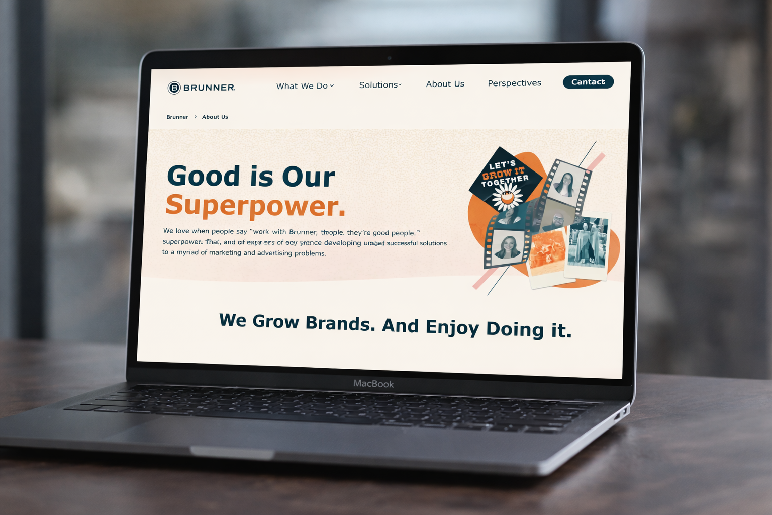
Design exploration focused on a few things. Establishing page templates that reflect strategic priorities (e.g., homepage, work landing pages, service category pages) was first, we began designing reusable components in a design system and creating page templates in Figma.

Refining brand typography, colors, and spacing to align with refreshed guidelines was also important and incorporated into our new design system. We also used this as an opportunity to elevate imagery such as hero visuals and content imagery to support storytelling.

We also iterated on navigation patterns and structure of the website for clarity and ease of use. All of the prototypes and design variants were vetted internally with cross-functional teams and stakeholders.

Development Collaboration

We worked in tandem with front-end developers and the creative team to ensure feasibility and fidelity:

  • Shared component libraries and style tokens
  • Design handoff with detailed specs to reduce iteration cycles
  • Regular check-ins to manage scope and preserve design intent

This collaboration ensured a smooth transition from design to production.

Validation & Exploration

Post-launch evaluation included:

  • Analytics review of engagement and click patterns
  • Heatmap tools to see interaction zones
  • Internal feedback from cross-functional teams
  • Iterative tweaks based on real-user behavior data

These sessions helped refine layouts, call-to-action prominence, and content visibility.

Reflection

This project reinforced that brand and UX are inseparable — a strong visual identity must be supported by thoughtful experience design. Collaborative processes with creative teams, designers, and developers elevated both the quality and impact of the final site.

Given more time, I would expand formal user testing and explore personalized content paths to further tailor experiences by audience segment (e.g., prospects vs clients).

Thanks for reading!

View more projects